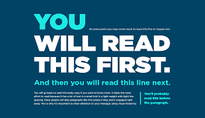
Visual hierarchy in web design refers to the arrangement of elements to guide users’ attention and convey the importance of information. Effective visual hierarchy helps users easily navigate a website, understand content, and engage with key elements. By prioritizing information visually, designers can enhance usability and create a more intuitive user experience.

Key Principles of Visual Hierarchy
Size and Scale
Larger elements attract more attention: Using size and scale to emphasize important content helps guide users’ focus. For example, headlines are typically larger than body text to signify their importance. Consequently, users naturally gravitate toward larger elements first, making it easier for them to find key information.
Contrast and Color
High contrast improves visibility: Utilizing contrast between text and background colors enhances readability and draws attention to critical areas. Bold colors and high-contrast combinations can highlight calls to action (CTAs) and other significant elements. Moreover, color can be used to establish a visual hierarchy by differentiating between various types of content.
Typography
Different fonts and weights convey importance: Typography plays a crucial role in visual hierarchy. Use font size, weight, and style variations to distinguish headings, subheadings, and body text. For instance, a larger, bolder font for headings and a smaller, lighter font for body text helps users quickly understand the content structure.
Spacing and Layout
Effective use of spacing enhances clarity: Spacing, including margins and padding, helps separate and organize content. Adequate white space around elements improves readability and prevents visual clutter. Additionally, aligning elements in a grid or structured layout provides a clear visual flow, guiding users through the content in a logical manner.
Implementing Visual Hierarchy in Web Layouts
Header and Navigation
Highlighting key navigation elements: The header and navigation are crucial for guiding users through your site. Use visual hierarchy to make primary navigation options prominent, using larger fonts or contrasting colors. Position important navigation items at the top of the page for easy access.
Content Sections
Organizing content into sections: Break content into distinct sections with clear headings and subheadings. Use typography and spacing to differentiate between sections and highlight key points. This approach helps users quickly scan and locate information.
Calls to Action
Making CTAs stand out: Calls to action should be easily identifiable and visually distinct. Use color contrast, size, and positioning to make CTAs prominent. Additionally, ensure that CTAs are placed strategically where users are likely to engage, such as at the end of compelling content.
Imagery and Visual Elements
Using images to support hierarchy: Images and visual elements can enhance the visual hierarchy by drawing attention to key areas. Use high-quality visuals to complement text and highlight important information. However, ensure that images are relevant and do not distract from the main content.
Testing and Refining Visual Hierarchy
User Testing
Gathering feedback from users: Conduct user testing to evaluate how well your visual hierarchy guides users. Observe how users interact with your site and gather feedback on their experience. Use this information to refine and improve the visual hierarchy.
Analytics and Performance
Monitoring engagement metrics: Analyze user behavior metrics, such as click-through rates and bounce rates, to assess the effectiveness of your visual hierarchy. Adjust your design based on data insights to enhance user engagement and achieve your design goals.
Iterative Design
Continuous improvement: Visual hierarchy is not a one-time fix but an ongoing process. Regularly review and adjust your design based on user feedback and performance metrics. This iterative approach ensures that your visual hierarchy remains effective as user needs and design trends evolve.
Conclusion: Crafting Effective Visual Hierarchy
Creating a strong visual hierarchy in web layouts is essential for guiding users and enhancing their experience. By using size, contrast, typography, spacing, and strategic placement, designers can ensure that users easily find and engage with key content. Continuous testing and refinement help maintain an effective visual hierarchy, leading to a more intuitive and user-friendly website.


