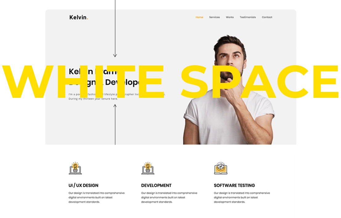
White space, also known as negative space, is the area between design elements on a page. It is crucial for creating a clean and organized layout that enhances readability and user experience. Effective use of white space can improve focus, guide user attention, and contribute to a visually appealing design. By understanding and applying white space principles, you can create more engaging and functional web designs.
Key Principles of White Space
Enhancing Readability
Improve text clarity with spacing: White space around text blocks helps improve readability by making content easier to scan and understand. Adequate line spacing (leading) and paragraph spacing prevent text from feeling cramped, making it more comfortable for users to read. Ensure there is enough space between headings and body text to clearly differentiate content sections.

Focusing User Attention
Direct attention with strategic spacing: Use white space to draw attention to important elements such as calls to action (CTAs) or key messages. By surrounding these elements with ample white space, you can make them stand out and guide users toward desired actions. This approach helps users quickly identify and engage with primary content without distraction.
Creating a Balanced Layout
Achieve visual harmony with spacing: White space helps create a balanced and harmonious layout by preventing overcrowding and visual clutter. A well-balanced design ensures that each element has room to breathe, contributing to a more organized and aesthetically pleasing appearance. Use margins, padding, and spacing to create a sense of equilibrium on the page.
Improving Navigation
Simplify navigation with clear spacing: Effective use of white space enhances navigation by making interactive elements, such as buttons and links, more accessible. Ensure there is sufficient space around navigation items to avoid accidental clicks and improve usability. Additionally, clear spacing helps users quickly locate and interact with navigation options.
Strategies for Using White Space
Consistent Margins and Padding
Maintain uniform spacing: Consistent margins and padding around elements create a cohesive and orderly design. Define standard spacing values for different types of content and stick to them throughout your design. This consistency helps users easily scan and understand the layout.
Hierarchical Spacing
Differentiate content with hierarchy: Use white space to establish a visual hierarchy within your design. For example, increase spacing around headings and subheadings to emphasize their importance and separate them from body text. Hierarchical spacing helps users navigate and comprehend content more effectively.
Minimalist Design
Adopt a minimalist approach: Embracing minimalist design principles involves using white space to reduce visual clutter and focus on essential elements. Limit the number of design elements on a page and use white space to highlight key content. This approach results in a cleaner, more focused user experience.
Responsive Design Considerations
Adapt white space for different devices: Ensure that white space is effectively utilized across various screen sizes and devices. Responsive design should adjust white space to maintain readability and usability on mobile phones, tablets, and desktops. Test your design on multiple devices to ensure consistent spacing and layout.
Examples of Effective White Space Use
Clean Layouts
Create a streamlined look: Websites with clean layouts use white space to separate content sections and reduce visual clutter. For example, a homepage with ample white space around featured images and CTAs creates a visually appealing and user-friendly experience.
Focused CTAs
Highlight key actions: Effective CTAs are often surrounded by white space to make them stand out. For instance, a prominent “Sign Up” button with ample padding and surrounding space attracts users’ attention and encourages clicks.
Organized Forms
Improve form usability: Forms with well-spaced fields and labels are easier to complete. Adequate white space around input fields and instructions reduces user frustration and improves overall form usability.
Conclusion: Leveraging White Space for Better Design
White space is a powerful design tool that enhances readability, focus, and overall user experience. By understanding and implementing effective white space strategies, such as consistent margins, hierarchical spacing, and minimalist design, you can create more engaging and user-friendly websites. Embracing white space helps achieve a balanced, visually appealing layout that guides users’ attention and improves navigation.


