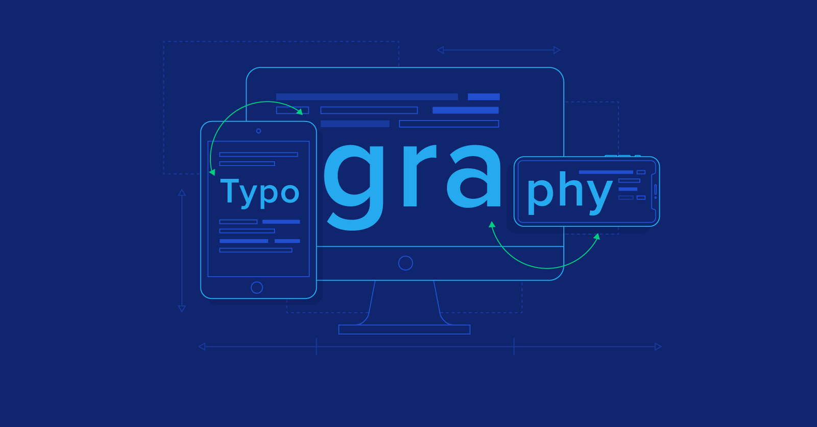
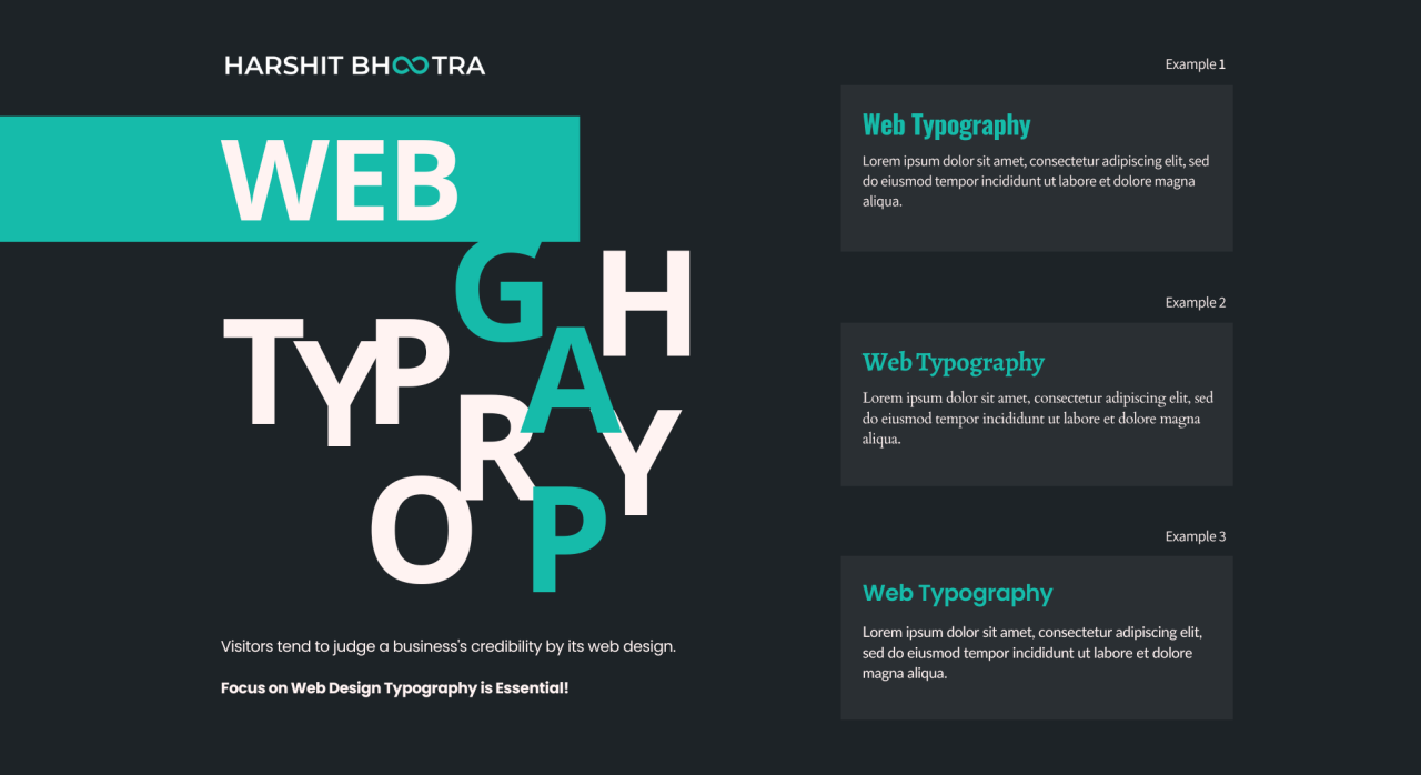
Web typography plays a crucial role in delivering content effectively and enhancing the overall user experience. Proper typography ensures that text is readable, engaging, and visually appealing. By following best practices for web typography, you can improve content accessibility, convey your brand’s message, and create a cohesive design.

Key Principles of Web Typography
Font Selection
Choose fonts wisely: Select fonts that align with your brand’s identity and are suitable for your website’s purpose. Use web-safe fonts or web fonts from reliable sources to ensure compatibility across different devices and browsers. Combine fonts thoughtfully, typically using one for headings and another for body text to create visual interest.
Readability
Prioritize ease of reading: Ensure that your text is easy to read by choosing appropriate font sizes and styles. Body text should be large enough (usually 16px or more) to be comfortable for reading. Use line heights (leading) that improve readability by preventing text from appearing cramped.
Contrast and Color
Enhance readability with contrast: Ensure sufficient contrast between text and background colors. High contrast improves legibility, especially for users with visual impairments. Avoid using light text on a light background or dark text on a dark background.
Line Length and Spacing
Optimize line length and spacing: Maintain an optimal line length, typically between 50-75 characters per line, to enhance readability. Adjust line spacing (leading) to prevent lines from appearing too close together. Adequate spacing between paragraphs also improves text organization and readability.
Typography Best Practices
Responsive Typography
Adapt typography for different devices: Implement responsive typography to ensure text scales appropriately across various screen sizes. Use relative units (em, rem) rather than fixed units (px) to allow text to adjust based on the user’s device and settings.
Hierarchical Text
Create a visual hierarchy: Use different font sizes, weights, and styles to establish a clear hierarchy. Headings should be distinct from body text and progressively smaller for subheadings. This hierarchy helps users quickly scan and understand the content structure.
Font Pairing
Combine fonts effectively: Choose font pairs that complement each other and create visual harmony. Typically, pair a serif font with a sans-serif font to create contrast and interest. Ensure that the fonts you choose are legible and work well together in different contexts.
Consistent Styling
Maintain consistency: Apply consistent typography styles across your website to create a cohesive design. Use the same font sizes, colors, and spacing for similar types of content. Consistency helps create a unified look and improves user experience.
Accessibility Considerations
Enhance accessibility: Ensure that your typography supports accessibility standards. Use fonts that are readable for users with dyslexia or other visual impairments. Implement sufficient contrast ratios and avoid using font styles that may hinder readability, such as overly decorative fonts.
Typography Tools and Techniques
Font Loading Strategies
Optimize font loading: Use font loading strategies to improve page performance. Employ techniques like font subsetting, which includes only the characters needed, and asynchronous loading to prevent fonts from blocking page rendering. Additionally, consider using system fonts for faster loading times.
CSS Typography Properties
Utilize CSS properties effectively: Leverage CSS properties to control typography. Properties such as font-family, font-size, font-weight, line-height, and letter-spacing allow you to customize text appearance. Use CSS media queries to adjust typography based on screen size and resolution.
Testing Across Devices
Test typography on various devices: Ensure your typography looks good on different devices and browsers. Test text rendering on various screen sizes and resolutions to verify readability and visual appeal. Regular testing helps identify and address any typography issues.
Examples of Effective Web Typography
Modern Websites
Showcase clean, readable designs: Modern websites often feature clean typography with ample white space, readable font sizes, and high contrast. For example, websites like Apple and Google use simple, effective typography to enhance user experience and readability.
Editorial Sites
Use typography to enhance content: Editorial websites benefit from thoughtful typography that supports content readability. Large, bold headings and well-spaced body text make articles more engaging and easier to read.
E-Commerce Sites
Improve user experience with clear text: E-commerce sites use typography to highlight product information and calls to action. Clear, legible text helps users quickly understand product details and navigate the site effectively.
Conclusion: Mastering Web Typography
Effective web typography is essential for creating engaging and user-friendly websites. By selecting appropriate fonts, prioritizing readability, and implementing best practices for font pairing, contrast, and responsive design, you can enhance the overall user experience. Consistent and accessible typography not only improves readability but also reinforces your brand’s identity and message.


