Modern web design requires flexible and responsive layouts that adapt to various screen sizes and devices. CSS Grid and Flexbox are powerful layout systems that enable designers to create sophisticated and dynamic layouts with ease. This article explores how to leverage CSS Grid and Flexbox to build modern, responsive web layouts.
Understanding CSS Grid
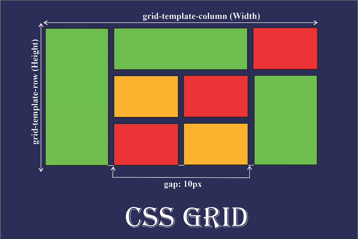
CSS Grid Layout is a two-dimensional layout system that allows you to create complex grid-based designs. It provides a robust framework for designing both rows and columns, making it ideal for large-scale layouts.
- Basic Grid Structure: Define a grid container with
display: gridand set up rows and columns usinggrid-template-rowsandgrid-template-columns.css
.grid-container {

display: grid;

grid-template-columns: repeat(3, 1fr);

grid-template-rows: repeat(2, auto);

gap: 10px;

}
- Grid Items: Place items within the grid using
grid-columnandgrid-rowproperties to control their position and span.css
.item {

grid-column: span 2;

grid-row: 1 / 3;

}
- Responsive Design: Create responsive grids by using media queries to adjust the grid structure based on screen size.
css
@media (max-width: 768px) {

.grid-container {

grid-template-columns: 1fr;

}

}
Understanding Flexbox
Flexbox (Flexible Box Layout) is a one-dimensional layout system designed for aligning items along a row or column. It simplifies the distribution of space and alignment within a container.
- Basic Flexbox Setup: Define a flex container with
display: flexand control item alignment using properties likejustify-contentandalign-items.css
.flex-container {

display: flex;

justify-content: space-between;

align-items: center;

}
- Flex Items: Adjust the size and order of flex items using
flex-grow,flex-shrink, andflex-basisproperties.css
.item {

flex: 1 1 auto;

}
- Responsive Flexbox: Use media queries to change the flex direction or alignment for different screen sizes.
css
@media (max-width: 768px) {

.flex-container {

flex-direction: column;

}

}
Combining CSS Grid and Flexbox
CSS Grid and Flexbox can be used together to create more complex and responsive layouts. For example, you can use Grid for the overall page layout and Flexbox for individual components within grid items.
- Grid for Layout: Use Grid to define the overall page structure, such as headers, sidebars, and content areas.
css
.layout-container {

display: grid;

grid-template-columns: 1fr 3fr;

grid-template-rows: auto 1fr auto;

}
- Flexbox for Components: Within grid items, use Flexbox to align and distribute content.
css
.content {

display: flex;

justify-content: center;

align-items: center;

}
Best Practices for Using CSS Grid and Flexbox
- Use Grid for Complex Layouts: CSS Grid is ideal for complex, two-dimensional layouts with both rows and columns. Use it for overall page structures and large components.
- Use Flexbox for Simple Alignments: Flexbox excels in one-dimensional layouts where alignment and spacing of items along a single axis are needed. Use it for navigation bars, buttons, and simple alignments within grid items.
- Combine for Flexibility: Combine Grid and Flexbox to take advantage of their strengths. Use Grid for the main layout and Flexbox for finer control within grid cells or other components.
- Prioritize Accessibility: Ensure that layouts are accessible and usable across different devices and screen readers. Test designs for responsiveness and readability.
Examples of CSS Grid and Flexbox in Action
Grid Layout Example
html
<div class="grid-container">

<div class="header">Header</div>

<div class="sidebar">Sidebar</div>

<div class="main">Main Content</div>

<div class="footer">Footer</div>

</div>.grid-container {
display: grid;
grid-template-columns: 1fr 3fr;
grid-template-rows: auto 1fr auto;
gap: 10px;
}
.header { grid-column: 1 / –1; }
.sidebar { grid-row: 2 / 3; }
.main { grid-row: 2 / 3; }
.footer { grid-column: 1 / –1; }
</style>
Flexbox Layout Example
html
<div class="flex-container">

<div class="item">Item 1</div>

<div class="item">Item 2</div>

<div class="item">Item 3</div>

</div>.flex-container {
display: flex;
justify-content: space-around;
align-items: center;
}
.item {
flex: 1;
margin: 5px;
}
</style>
Conclusion
CSS Grid and Flexbox are powerful tools for creating modern, responsive web layouts. CSS Grid offers a comprehensive solution for two-dimensional layouts, while Flexbox provides flexibility for one-dimensional arrangements. By leveraging both systems effectively, you can build sophisticated and adaptable layouts that enhance user experience across various devices and screen sizes.