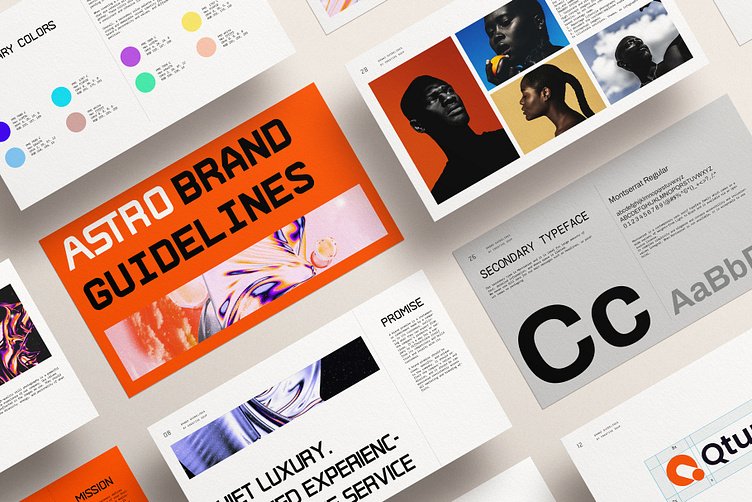
In today’s digital landscape, your website is often the first interaction potential customers have with your brand. Creating a cohesive brand identity through web design is crucial to making a lasting impression and establishing trust. A well-designed website should not only be visually appealing but also align with your brand’s values, mission, and messaging. In this blog post, we’ll explore how to achieve a cohesive brand identity through web design by focusing on key elements like color schemes, typography, imagery, and user experience.
1. Understanding the Importance of Cohesive Branding
a. First Impressions Matter
- Your website is a digital storefront. A cohesive brand identity ensures that visitors instantly recognize your brand, making it more likely that they’ll engage with your content and return in the future.
b. Building Trust and Credibility
- Consistency in branding across your website helps build trust. When your design elements align with your brand’s messaging and values, it reinforces credibility and fosters a sense of reliability.
c. Enhancing User Experience
- A cohesive brand identity enhances the overall user experience by creating a seamless and intuitive journey through your website. Users are more likely to stay on your site and explore further when the design is consistent and well-organized.
2. Key Elements of a Cohesive Brand Identity in Web Design

a. Color Scheme
- Consistency Across Platforms: Choose a color palette that reflects your brand’s personality and use it consistently across your website and other digital platforms.
- Emotional Impact: Colors evoke emotions and can influence user behavior. For example, blue often conveys trust, while red can evoke excitement or urgency. Select colors that align with the feelings you want to evoke in your audience.
b. Typography
- Font Selection: Choose fonts that align with your brand’s tone and style. A luxury brand might opt for elegant serif fonts, while a tech company may choose modern sans-serif fonts.
- Readability: Ensure that your chosen fonts are easy to read on all devices. Consistency in font usage across headers, body text, and call-to-action buttons contributes to a cohesive design.
c. Imagery and Graphics
- Visual Style: Use imagery and graphics that align with your brand’s aesthetic. Whether it’s high-quality photography, custom illustrations, or icons, ensure that all visuals maintain a consistent style.
- Authenticity: Authenticity is key in modern branding. Use real images that represent your products, services, and target audience, rather than relying on generic stock photos.
d. Logo and Branding Elements
- Prominent Placement: Your logo should be prominently displayed on your website, particularly in the header and footer. Ensure that it links back to the homepage for easy navigation.
- Consistent Use: Use branding elements such as your logo, taglines, and brand marks consistently across all pages. This reinforces brand recognition and identity.
3. Designing for User Experience and Functionality
a. Intuitive Navigation
- User-Centered Design: Your website’s navigation should be intuitive and user-friendly. Organize content in a way that makes it easy for visitors to find what they’re looking for.
- Consistent Layout: A consistent layout across all pages helps users navigate your site more easily. Avoid drastic changes in design or structure that could confuse visitors.
b. Responsive Design
- Mobile Optimization: Ensure that your website is fully responsive and functions well on all devices. A cohesive brand identity should be maintained regardless of screen size or platform.
- Performance: Fast-loading pages contribute to a positive user experience. Optimize images, reduce unnecessary code, and choose a reliable hosting provider to improve site performance.
c. Interactive Elements
- Engagement Tools: Use interactive elements like buttons, forms, and sliders to engage users. Ensure that these elements align with your brand’s color scheme and typography.
- Micro-Interactions: Small animations or feedback, such as a button changing color when hovered over, can enhance the user experience and make your site feel more interactive.
4. Examples of Cohesive Brand Identity in Web Design
a. Apple
- Minimalism and Consistency: Apple’s website is a prime example of cohesive branding. The minimalistic design, consistent use of typography, and high-quality imagery align perfectly with their brand identity, reinforcing the message of innovation and elegance.
b. Coca-Cola
- Vibrant and Energetic: Coca-Cola’s website uses bold red colors, dynamic typography, and imagery that reflects happiness and togetherness. Every design element is consistent with the brand’s global identity.
c. Airbnb
- Community and Connection: Airbnb’s website design emphasizes community, belonging, and connection. The use of real images, warm colors, and user-friendly navigation aligns with their brand mission of making everyone feel at home, anywhere in the world.
Conclusion
Creating a cohesive brand identity through web design is essential for establishing a strong online presence. By focusing on elements like color schemes, typography, imagery, and user experience, you can ensure that your website not only looks great but also effectively communicates your brand’s values and mission. Consistency is key, and every design choice should reflect and reinforce your brand identity, making a lasting impression on your audience.


