Color is a powerful tool in web design that can significantly impact how users perceive and interact with a website. From evoking emotions to guiding user behavior, the use of color plays a crucial role in creating an effective and engaging web experience. Understanding color theory and its principles can help designers make informed decisions about color choices, ensuring that their website not only looks visually appealing but also serves its intended purpose effectively.
1. The Basics of Color Theory
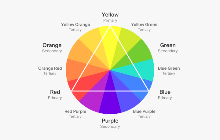
Color theory is a framework used to understand how colors interact with each other and how they can be combined to create harmonious and visually pleasing designs. It involves concepts such as the color wheel, color harmony, and the psychological effects of colors. The color wheel consists of primary, secondary, and tertiary colors, which can be combined to form various color schemes, including complementary, analogous, and triadic.

2. The Psychological Impact of Color
Colors have the ability to evoke specific emotions and reactions from users, making them an essential element in web design. For example:
- Red can evoke excitement, passion, and urgency, often used for calls to action.
- Blue is associated with trust, calm, and professionalism, making it popular for corporate and healthcare websites.
- Green symbolizes growth, harmony, and freshness, frequently used in eco-friendly and health-related designs.
- Yellow can convey optimism and energy but should be used sparingly to avoid overwhelming users.
Understanding the psychological impact of colors allows designers to choose hues that align with the brand’s message and the emotional response they want to evoke from their audience.
3. Creating a Color Scheme
A well-designed color scheme is essential for achieving visual harmony and coherence throughout a website. There are several types of color schemes to consider:
- Complementary Colors: Colors located opposite each other on the color wheel, such as blue and orange. This scheme creates a high contrast and vibrant look.
- Analogous Colors: Colors that are next to each other on the color wheel, like blue, blue-green, and green. This scheme offers a more harmonious and calming effect.
- Triadic Colors: Three colors that are evenly spaced around the color wheel, such as red, yellow, and blue. This scheme provides a balanced and vibrant look.
Selecting the right color scheme involves balancing visual appeal with functionality and ensuring that colors work well together to create a cohesive design.
4. Color Contrast and Accessibility
Ensuring sufficient color contrast is crucial for readability and accessibility. High contrast between text and background colors improves legibility, particularly for users with visual impairments. The Web Content Accessibility Guidelines (WCAG) recommend specific contrast ratios to ensure that content is accessible to all users. Tools and plugins are available to help designers check color contrast and make necessary adjustments to meet accessibility standards.
5. Color and Branding
Color plays a significant role in brand identity and recognition. Consistent use of brand colors across a website helps reinforce brand identity and create a memorable user experience. When designing a website, it’s important to incorporate the brand’s color palette and use colors that align with the brand’s values and messaging. This consistency helps build trust and recognition among users.
6. Emotional and Cultural Considerations
Colors can have different meanings and associations in various cultures, so it’s essential to consider the target audience when choosing colors for a website. For instance, while white is often associated with purity and simplicity in Western cultures, it can symbolize mourning in some Eastern cultures. Understanding these cultural nuances helps ensure that the color choices resonate positively with the intended audience.
7. Color Trends and Innovations
Web design trends evolve, and so do color preferences. Staying updated with current color trends can help designers create modern and relevant designs. For example, trends such as vibrant colors, muted pastels, and gradient effects are popular in contemporary web design. However, it’s important to balance trends with timeless principles to ensure that the design remains effective and functional over time.
8. Practical Tips for Using Color in Web Design
- Start with a Color Palette: Begin by selecting a primary color and building a palette of complementary or analogous colors to use throughout the website.
- Use Color Hierarchy: Differentiate elements such as headings, buttons, and links using varying colors and shades to create a visual hierarchy.
- Test on Multiple Devices: Ensure that colors appear consistently across different devices and screens to maintain visual integrity.
- Keep it Simple: Avoid using too many colors, as this can create visual clutter. Stick to a limited color palette for a clean and cohesive design.
Conclusion
Color theory is a fundamental aspect of web design that influences aesthetics, user experience, and brand identity. By understanding the psychological impact of colors, creating effective color schemes, and ensuring accessibility, designers can create visually engaging and functional websites. Incorporate color thoughtfully to enhance the overall user experience and communicate your brand’s message effectively.


