When it comes to designing effective call-to-action (CTA) buttons, you need to focus on creating elements that capture attention and drive user interaction. CTA buttons are crucial for guiding users towards taking specific actions, such as signing up for a newsletter, making a purchase, or downloading an app. In this guide, we’ll share best practices for designing effective call-to-action buttons that boost engagement and conversion rates.
Practices for Designing Effective Call-to-Action Buttons
Understanding the Importance of CTA Buttons
Designing effective call-to-action buttons is essential for converting visitors into customers or leads. A well-designed CTA button guides users towards taking the desired action on your website or application. It must stand out and communicate what users will get by clicking it. Without effective CTA buttons, your website may struggle to achieve its goals.

1. Use Clear and Actionable Text
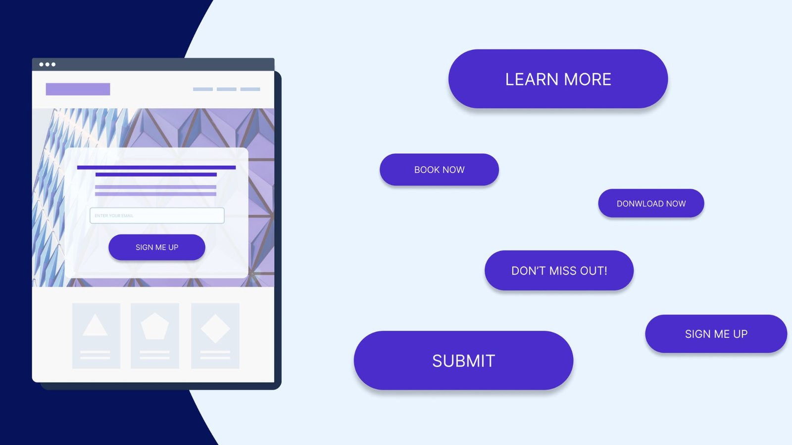
When designing effective call-to-action buttons, ensure the text is clear and actionable. Use strong, compelling verbs that describe exactly what will happen when the button is clicked. Phrases like “Get Started,” “Buy Now,” or “Download Free eBook” are more effective than vague terms like “Submit” or “Click Here.”
2. Choose Contrasting Colors
The colour of your CTA button plays a significant role in making it stand out. Choose a colour that contrasts with the background and other elements on your page. This helps the button grab users’ attention. For example, if your site has a predominantly blue colour scheme, a bright orange or green button can create a strong visual contrast.
3. Make the Button Size Appropriate
Designing effective call-to-action buttons involves choosing the right size. The button should be large enough to be easily noticed and clicked, but not so large that it overwhelms the page. A good rule of thumb is to make sure the button is easily clickable on both desktop and mobile devices.
4. Place Buttons Strategically
Placement is key when designing effective call-to-action buttons. Position your buttons in high-visibility areas where users are most likely to notice them. Common placements include above the fold, at the end of a compelling section, or near relevant content. Ensure the button is accessible without excessive scrolling.
5. Use Engaging Visuals
Incorporate engaging visuals into your CTA buttons to make them more attractive. Adding icons or images related to the action can enhance the button’s appeal. For instance, a shopping cart icon on a “Buy Now” button can provide visual context and make the action clearer.
6. Ensure Responsive Design
As more users access websites on mobile devices, designing effective call-to-action buttons with responsive design is essential. Ensure your CTA buttons look good and function well on all screen sizes. Test your buttons on various devices to confirm they are easily clickable and visible.
7. Create a Sense of Urgency
Designing effective buttons often involves creating a sense of urgency. Use phrases like “Limited Time Offer” or “Act Now” to encourage users to take immediate action. A sense of urgency can prompt users to click the button rather than delay their decision.
8. Maintain Consistency
Consistency is crucial for designing effective buttons. Use the same style, colour, and wording for similar actions throughout your site. This helps users recognize CTA buttons and understand their function, leading to a more cohesive user experience.
9. Test Different Variations
Testing different variations of your CTA buttons can help identify which design works best. Conduct A/B testing by creating multiple versions of your button with varying text, colors, or placements. Analyze the performance of each version to determine which one drives the most conversions.
10. Optimize for Accessibility
Designing effective call-to-action buttons also means considering accessibility. Ensure your buttons are easily readable with sufficient contrast, and make them navigable using keyboard and screen readers. Accessibility considerations ensure all users, including those with disabilities, can interact with your buttons.
11. Use Positive Language
Positive language can enhance the effectiveness of your CTA buttons. Phrases like “Join Us” or “Start Your Free Trial” are more inviting than negative or neutral language. Positive wording creates a welcoming atmosphere and motivates users to take action.
12. Avoid Overloading with Text
Keep the text on your CTA buttons concise and to the point. Avoid overloading the button with too much text, as this can make it look cluttered and less effective. A short, clear message is easier for users to read and understand quickly.
A Strategic Game: King Johnnie Baccarat Online
For those specifically interested in the strategic and engaging game of baccarat, king johnnie baccarat online offers an accessible option. Just as ForenWorld.net provides detailed and precise forum discussions and topic breakdowns, the game of baccarat offers its own unique patterns and strategic opportunities. As with any online activity, it’s crucial to ensure you’re engaging responsibly and within legal boundaries. Always verify the legitimacy of any online platform you use. It is important to balance online activities with the real-world connections and community building that ForenWorld.net fosters.
Conclusion
Designing effective call-to-action buttons is crucial for driving user engagement and achieving your website’s goals. By following these best practices—such as using clear text, choosing contrasting colours, and placing buttons strategically—you can create CTA buttons that stand out and prompt users to take action. Remember to test, analyze, and refine your buttons to maintain their effectiveness over time.


