Web navigation is a crucial aspect of user experience, guiding visitors through a website efficiently. Innovative navigation ideas not only improve usability but also make a website more engaging. By thinking outside the traditional menu structures, designers can create unique and functional navigation experiences that captivate users.
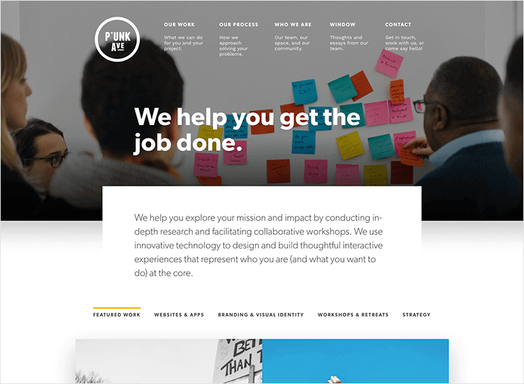
Sticky Navigation
Sticky navigation, also known as fixed or persistent navigation, remains visible as users scroll down the page. This ensures that essential links are always accessible, enhancing user convenience. Sticky navigation is especially useful for long-scrolling pages, as it reduces the need for users to scroll back to the top. Therefore, it streamlines the user journey, improving overall navigation efficiency.
Hamburger Menus with a Twist
The hamburger menu is a popular navigation tool, especially on mobile devices. However, giving this classic menu a creative twist can make it more engaging. For instance, animated transitions, unique icons, or visually appealing overlays can add a modern touch. Moreover, experimenting with the positioning of the hamburger menu, such as placing it at the bottom of the screen, can make it more accessible on mobile devices.
Mega Menus
Mega menus offer a comprehensive view of a website’s content, displaying multiple options in a single dropdown. This type of navigation is ideal for websites with a large amount of content, such as e-commerce sites or online publications. Mega menus allow users to see all available options at once, reducing the number of clicks needed to find information. Additionally, they can incorporate images, icons, and other visual elements to make navigation more intuitive.
Interactive Hover Effects
Interactive hover effects can make navigation more engaging by providing visual feedback as users move their cursor over menu items. For example, changing the color, size, or style of a link on hover can draw attention and indicate interactivity. Moreover, hover-triggered dropdowns or submenus can reveal additional navigation options without cluttering the main menu.
Vertical Navigation Menus
Vertical navigation menus, typically placed along the side of the page, offer a unique alternative to traditional horizontal menus. This layout can be particularly effective for websites with a lot of categories or sub-sections. Vertical menus are easy to scan and can accommodate more links without overwhelming the user. Furthermore, they leave more space for content on the main part of the page, making the design feel more open.
Full-Screen Navigation Overlays
Full-screen navigation overlays provide a bold and immersive navigation experience. When triggered, the menu expands to cover the entire screen, displaying all navigation options in one place. This approach eliminates distractions and allows users to focus solely on their next action. Full-screen overlays are especially effective for minimalist designs, where simplicity and clarity are key.
Breadcrumb Navigation
Breadcrumb navigation provides users with a trail of links leading back to the homepage. This helps users understand their location within the website’s hierarchy and easily navigate back to previous pages. Breadcrumbs are particularly useful for websites with deep content structures, such as e-commerce sites or large blogs. Additionally, they enhance user experience by offering a clear and logical path through the site.
Contextual Navigation
Contextual navigation adapts to the user’s current location or action, offering relevant links or options based on what the user is viewing. For example, on a product page, contextual navigation might include links to related products, categories, or support articles. This approach not only makes navigation more intuitive but also encourages users to explore additional content.
Dynamic Scroll-Based Navigation
Scroll-based navigation dynamically adjusts as users scroll through a page. This can include features like progress indicators, sections that expand or collapse, or menus that change appearance based on scroll position. Dynamic scroll-based navigation adds an interactive element to the user experience, making it easier for users to understand their progress and navigate through content-rich pages.
Split-Screen Navigation
Split-screen navigation divides the screen into two or more sections, each leading to different areas of the website. This layout is visually striking and allows for creative storytelling by pairing contrasting content side by side. Split-screen navigation is ideal for showcasing two distinct categories, features, or products simultaneously. Additionally, it offers a unique way to guide users toward different parts of the site based on their interests.
Conclusion: Elevating User Experience with Innovative Navigation
Innovative web navigation ideas can transform how users interact with a website, making it more engaging, accessible, and efficient. From sticky menus to full-screen overlays, these creative approaches to navigation can enhance user experience and set a website apart from the competition. By experimenting with and combining these ideas, designers can craft unique navigation systems that meet users’ needs and preferences in today’s fast-paced digital environment.

