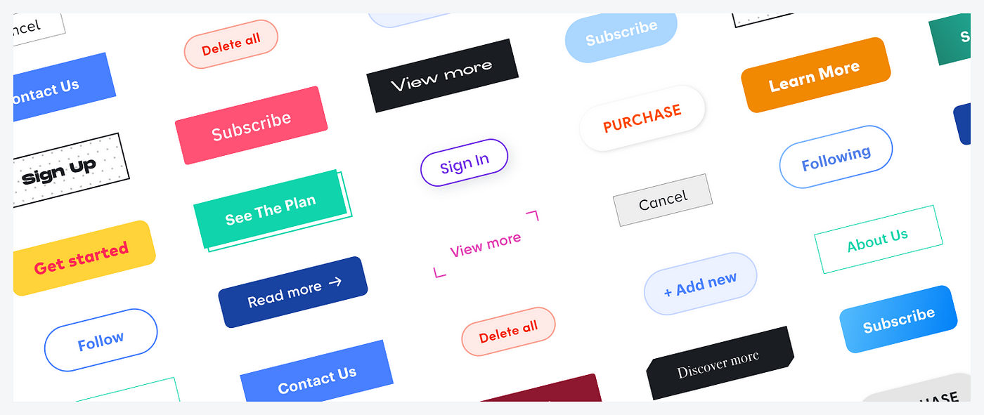
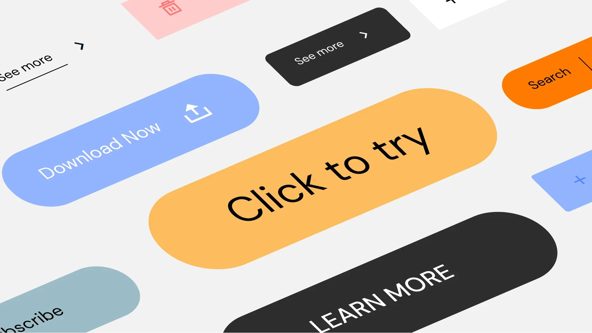
Call-to-action (CTA) buttons are essential components of a website’s design, guiding users toward completing desired actions such as signing up for a newsletter, purchasing a product, or downloading a resource. Well-designed CTA buttons can significantly improve user engagement and conversion rates. This article will explore the key elements of designing effective CTA buttons that capture attention and drive action.
1. Importance of Clear and Actionable Text
The text on your CTA button, often referred to as the CTA copy, should be clear, concise, and actionable. It should communicate exactly what the user will achieve by clicking the button. Using verbs like “Download,” “Sign Up,” “Get Started,” or “Learn More” encourages users to take immediate action. Avoid vague language and ensure that the text aligns with the value proposition of the offer.
2. Choosing the Right Color for Your CTA Button
Color plays a critical role in making your CTA button stand out. The color should contrast with the surrounding elements to grab the user’s attention but still harmonize with the overall design. Common choices include:
- Red: Creates a sense of urgency and excitement.
- Green: Associated with positive actions like “Go” or “Start.”
- Orange/Yellow: Eye-catching and energetic, often used for limited-time offers.
- Blue: Trustworthy and dependable, often used for subscription-based services.
Conduct A/B testing to determine which color works best with your audience and design.

3. Optimal Placement of CTA Buttons
The placement of your CTA button is crucial for its effectiveness. Position it where users naturally look and are ready to take action. Common placements include:
- Above the Fold: Placing the CTA button in the top section of the page ensures it’s visible without users having to scroll.
- End of Content: After a blog post, video, or product description, when users are likely to be interested in taking the next step.
- Floating or Sticky Buttons: These remain visible as users scroll, making it easy for them to act at any point.
Consider the flow of your content and user behavior to determine the best location for your CTA buttons.
4. Creating a Sense of Urgency
Adding a sense of urgency to your CTA can encourage users to act quickly. Phrases like “Limited Time Offer,” “Only a Few Left,” or “Sign Up Now” create a fear of missing out (FOMO), which can drive higher conversion rates. However, use urgency sparingly to avoid overwhelming or alienating your audience.
5. Size and Shape of CTA Buttons
The size of your CTA button should be large enough to stand out but not so large that it overwhelms other content. The shape also matters; rounded corners tend to be more inviting, while sharp edges can create a more formal look. Ensure that the button is easy to click on all devices, particularly for mobile users.
6. Ensuring Accessibility
Accessibility is an important consideration in CTA design. Ensure that your CTA buttons are usable by people with disabilities by:
- Providing sufficient color contrast between the button text and background.
- Adding descriptive text for screen readers.
- Ensuring buttons are large enough for users with motor impairments.
- Testing for keyboard navigation compatibility.
Accessible design not only benefits users with disabilities but can also improve the overall user experience.
7. Testing and Iterating CTA Designs
Continuous testing and iteration are key to optimizing your CTA buttons. Use A/B testing to compare different versions of your CTA buttons, experimenting with variations in color, text, placement, and size. Analyze performance metrics such as click-through rates and conversions to identify what works best for your audience.
8. Combining CTA Buttons with Strong Visuals
Pairing your CTA button with strong visuals, such as product images or directional cues, can increase its effectiveness. For example, an image of a person looking or pointing towards the button can draw the user’s eye to it. Make sure that the visuals support the CTA and don’t distract from it.
Conclusion
Designing effective call-to-action buttons is essential for guiding users toward desired actions and boosting conversion rates. By focusing on clear and actionable text, strategic color choices, optimal placement, and accessibility, you can create CTA buttons that not only capture attention but also drive meaningful engagement. Remember to test and refine your designs regularly to keep them effective in the ever-evolving digital landscape.


